Soil Heroes Foundation — Illustration & Editorial Design
Soil Heroes proves regenerative farming works with hard data, then shares what works so other farmers can follow. Their guidebook is how that knowledge travels. After six years of new research, some of its illustrations no longer matched the science. The job was to put that right without losing the look farmers already trusted.
Where Soil Heroes started
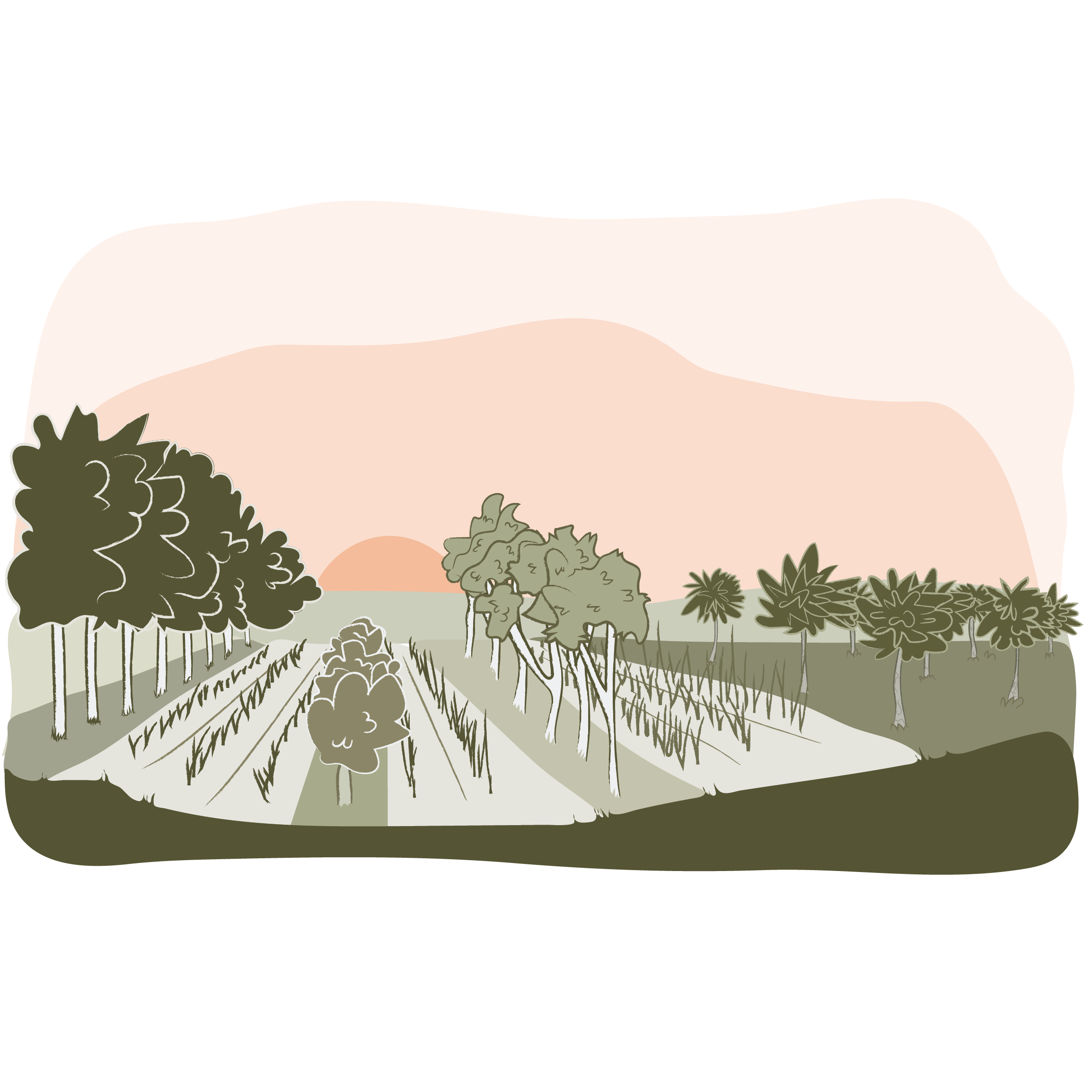
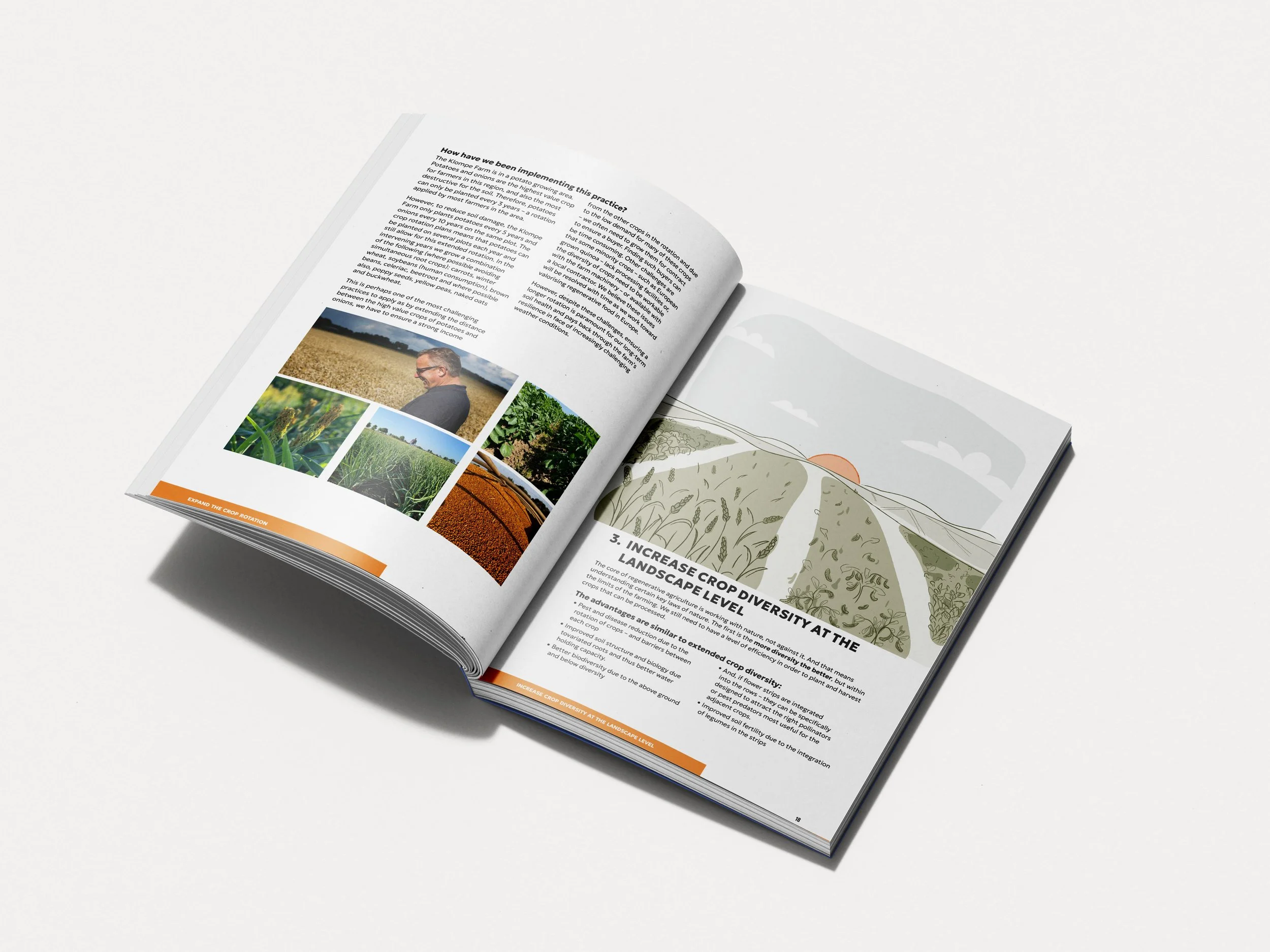
Soil Heroes is a Netherlands-based foundation running long-term trials on real, large-scale arable farms, measuring what regenerative practice actually does to soil health, water, biodiversity and the nutritional quality of the food grown. The reason they aim at big farms is simple: the larger the hectarage you can shift to regenerative, the larger the environmental gain. Their guidebook is how they pass that on, a field guide of around twenty regenerative practices, each one opening with an illustration that shows a farmer what the practice looks like.
The work was never in question. The pictures were. Six years on, the research had moved, and several illustrations no longer reflected the practices accurately. A new practice, phasing out synthetic pesticides, had no illustration at all. For a science-led foundation, an image that looks good but reads wrong quietly misleads the exact farmers it is meant to help.
“When Soil Heroes started, there was no information out there for a farmer on how to farm regeneratively. If a farmer can translate 200 hectares to regenerative, the impact on water quality and biodiversity is enormous.”
— Soil Heroes Executive DirectorWhat changed
Before: a respected guidebook carrying illustrations that had fallen behind the science, a brand new practice with no image, and an update that had stalled before reaching completion.
After: 11 illustrations updated or created from scratch, each accurate to the current research and matched to the original style, ready to carry the foundation's latest thinking to farmers in both print and digital.
How we got there
The first decision was a restrained one: match the original illustration style rather than impose a new look. Two reasons. Farmers already know the guide, so continuity matters, and matching the existing style meant the foundation could make small tweaks later without paying to redraw all twenty images from scratch. The right call for the asset and the budget, not the flashy one.
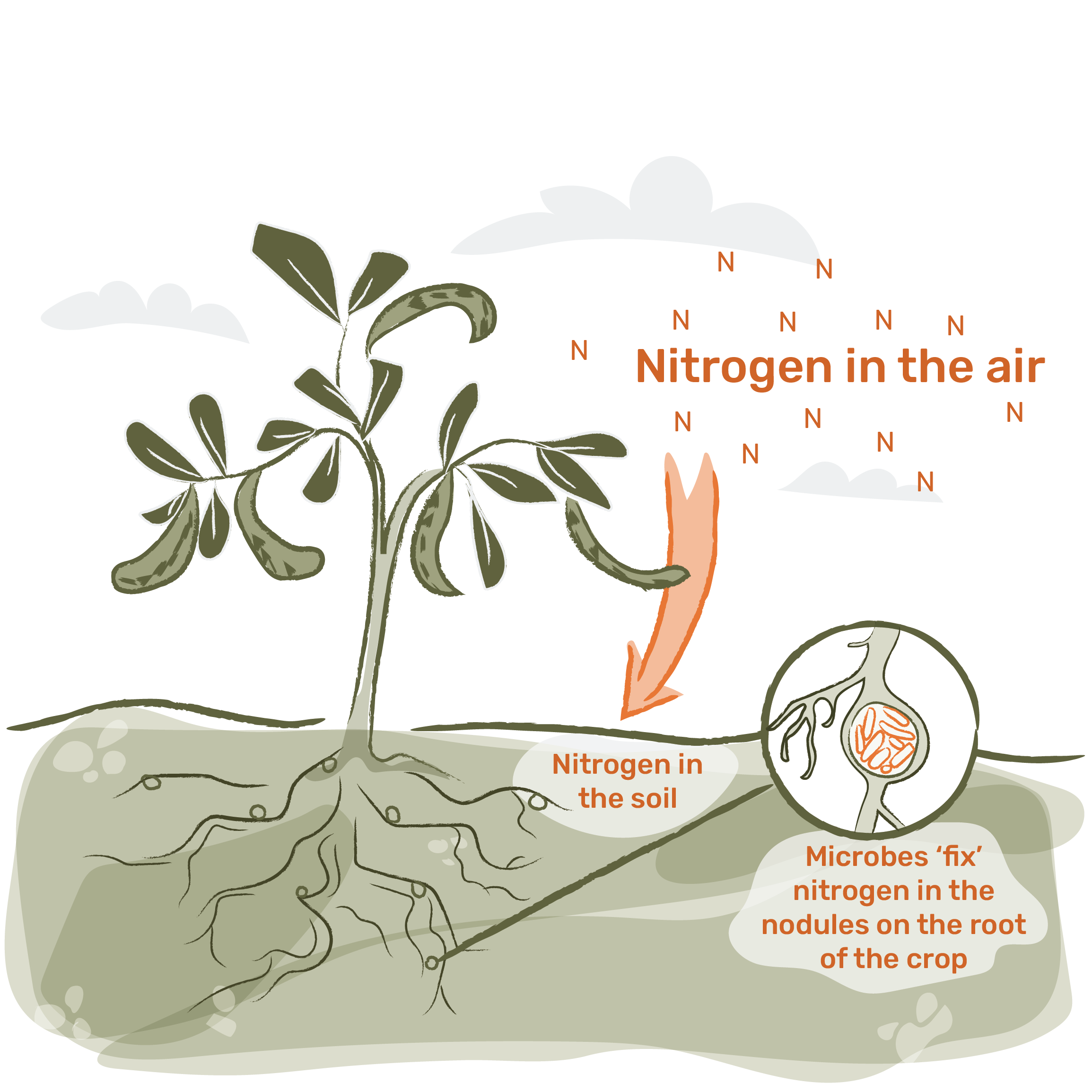
The second was about fit. Accuracy was the entire point, and accuracy in scientific illustration is its own discipline. Isabel brings a background in scientific and medical illustration, and years spent around nutrition and agronomy research, so the practices could be drawn so they are correct as well as clear. A regenerative practice has to be legible to a busy farmer and true to the science in the same image.
Then there was the new concept. The illustration for phasing out synthetic pesticides had never existed, so it was built from the foundation's own research, in the established style, as if it had always belonged there.