
CatchAll Environmental
Evergreen Design Support helped a regionally successful eco-conscious business go from inconsistent in-house materials to applying their brand identity so that it works as hard as they do.
The Challenge
CatchAll Environmental helps landowners and property managers solve complex stormwater and environmental challenges—work that's often literally underground and hard for non-technical clients to visualize or understand.
But their client-facing materials weren't doing them any favors. Years of ad-hoc document creation had led to:
Inconsistent visual presentation across brochures, flyers, and leave-behinds
Technical jargon that created barriers instead of building trust
Cluttered layouts that buried the most important information
Materials that didn't support the real-world conditions of field consultations
Their team knew their work was solid. They needed materials that reflected that professionalism and helped potential clients actually understand what they'd be getting.
The Result
CatchAll now has a professional, cohesive toolkit that does what their old materials couldn't: clearly communicate their expertise while building client confidence.
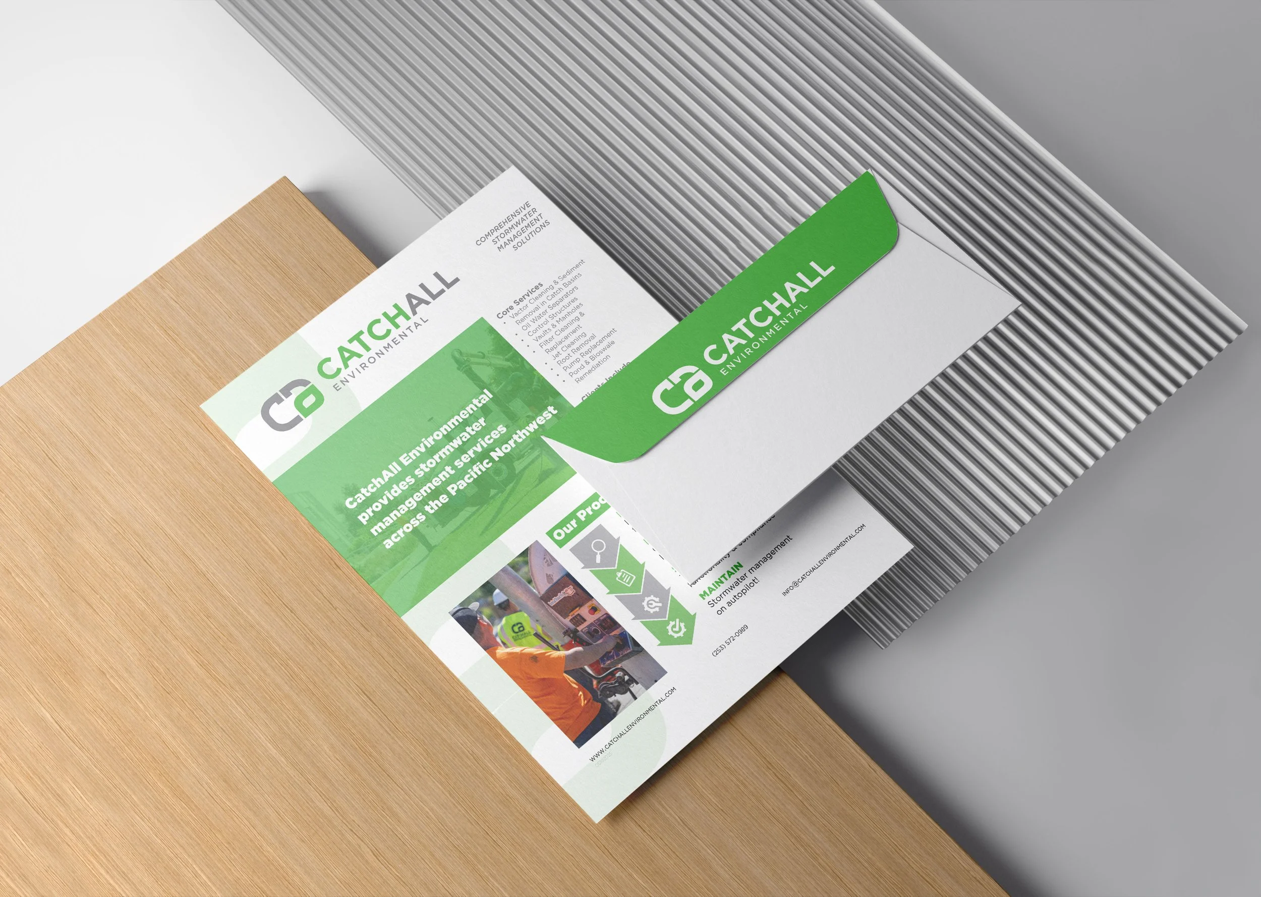
The new system includes service brochures, informative one-pagers, and leave-behind materials, and digital ads that support their team through every stage of client engagement—from first introduction to consultation close.
More importantly, the templates and standards mean CatchAll can maintain this consistency as they grow, without starting from scratch every time they need a new piece.
The Solution
The Strategy
I worked with CatchAll to audit what they & their clients actually need from their materials—as educational tools, as event collateral, in field conversations, during technical consultations, and in analog, hands-off moments. We then redesigned their client engagement toolkit from the ground up.
The approach:
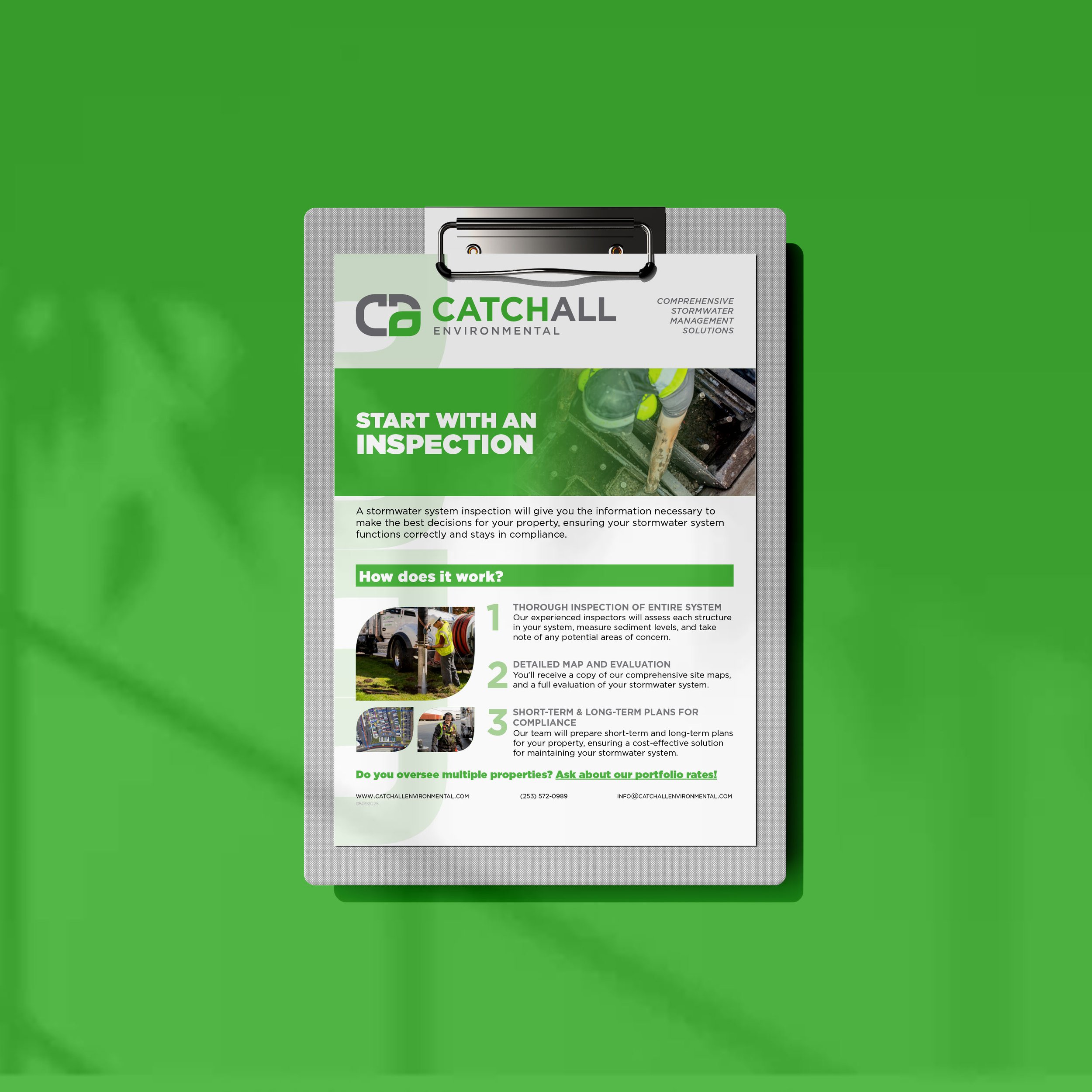
Simplified technical content by translating industry terminology into plain language that landowners could quickly grasp, and putting the landowner-centric language front and center.
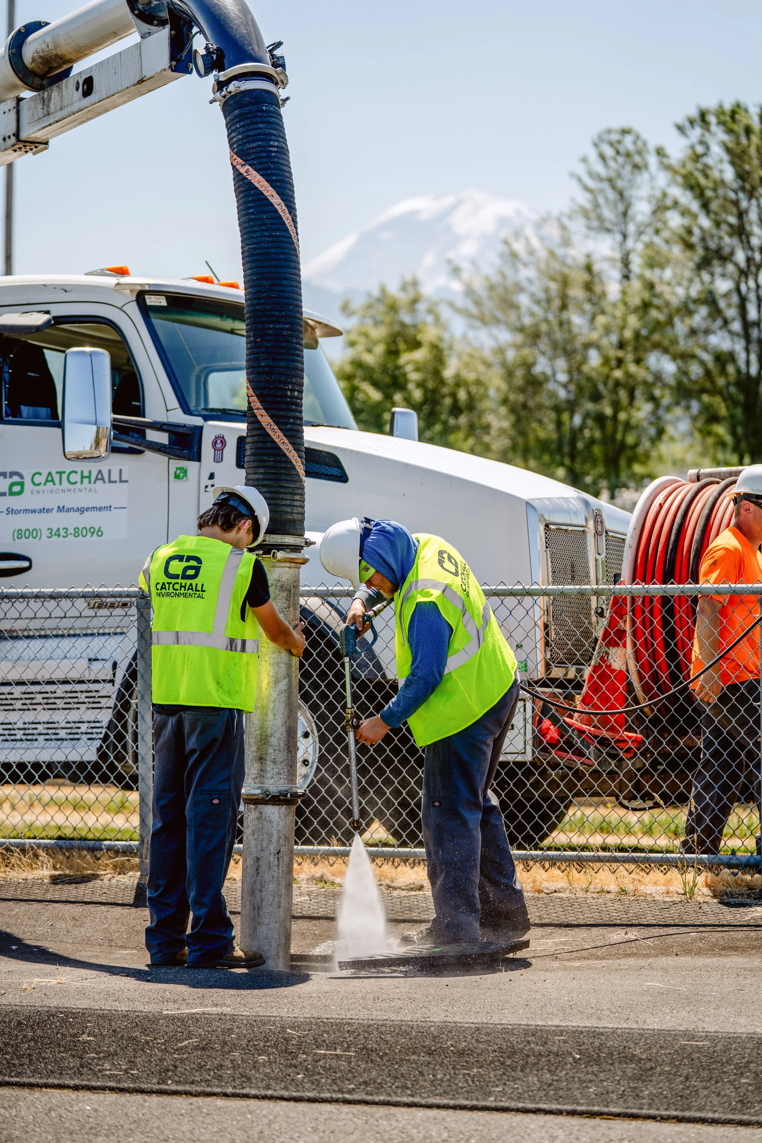
Image-forward, without the overwhelm. Clients needed images to understand the work being done, so we featured more in-progress photos from a professional photo session—leaving out (whenever possible) previously used low-quality images snapped by technicians.
Created structured templates with clear visual hierarchy and adaptive layout rules—so future materials could maintain consistency and clients could learn what format to expect information in.
Designed for real-world use with ads that didn’t overwhelm with information, and educational brochures structured for an easy flow of information.
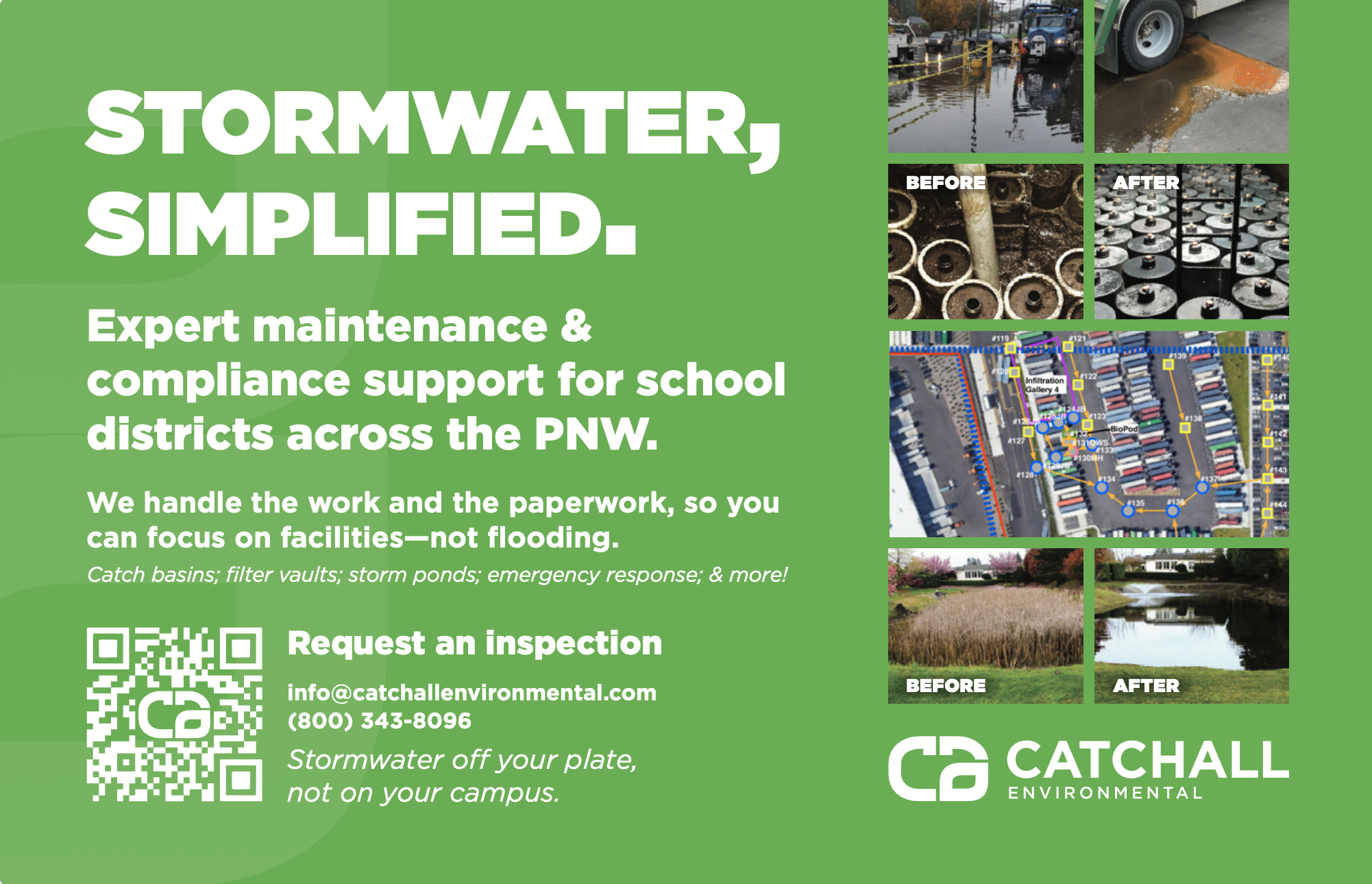
Old Ad (below, upper left)
Information overwhelm, no client-centric messaging. Small CTA competing with too many low quality images.
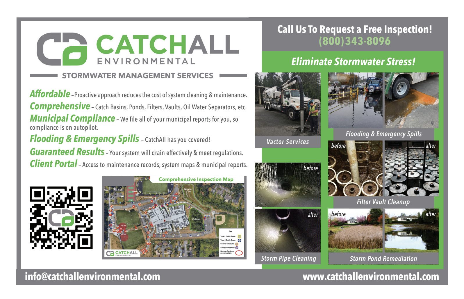
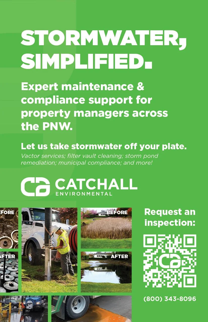
New Ads (above, right & lower left images)
Simplified information & messaging, tailored to clients real concerns and a clear CTA.